The Power of Information Equity
“If you can’t explain it simply, you don’t understand it well enough.”
If I had to explain my philosophy in two words, they would be “information equity.”
As the Principal of Urban3, my job is to travel around the country and talk to people about how their community is going broke, and why tax systems are to blame. These are complex issues that are baked into every aspect of our lives, whether or not we can see them, and they demand us all to look at our communities from a fresh perspective. I can’t assume that our message is obvious, even to elected officials and planners who are immersed in statistics and public policy every day.
I ran into this communication barrier head-first about ten years ago when I was working as a project manager for a real estate development company in Asheville, North Carolina called Public Interest Projects. We were looking to develop in a neglected section of Asheville, just off the main downtown core. We saw so much potential for infill, and were hopeful that the City would see it as a financial boon. We proposed a mixed-use building consisting of street-level retail, a hotel, needed city parking, and residences all in one acre. What was not to love?
But when it came time to get approval from the City, folks hemmed and hawed. It was too complicated for people to get their brains around. Public Interest Projects had long advocated the economic and environmental benefits of urbanism, but the key was showing people the math. So we embarked on comparing the impact of different development types and scales on the tax rolls. We had to demonstrate the benefits of mixed-use development compared with single-use suburban buildings. Partly out of frustration, we came up with this apples-to-apples graphic to normalize the differences between the two development patterns and prove the financial productivity of this beautiful downtown-style building. People had to see the difference.

This was a realization derived from simple math, but it was the first proverbial flap of the butterfly wing that would eventually transform the way we view mixed-use development.
Getting on the same page
Around that time, I ended up speaking on an economics panel at the 2011 Congress for New Urbanism in Madison, Wisconsin. Most economics panels involve a lot of spreadsheets and bullet points, so I was prepared to be bored. Then someone named Chuck Marohn got up on stage and gave an impassioned (and spreadsheet-free) talk about the massive expenditures of basic road maintenance. He did the math! I thought “Man, this guy rocks!”
I’d been thinking about city revenues, and here was someone raising the alarm about costs. Chuck and I like to say that this moment was like chocolate and peanut butter meeting for the first time.
Most importantly, we both appreciated the value of simple visualizations. On that day, we realized that all other arguments fall by the wayside when you do the math and simply present data. It turns out that when you try to make a bigger argument than you need to, the audience tends to tune out. However, by providing a basic set of tools and figures, you can make people curious and empower them to figure out problems for themselves. That’s the difference between throwing spreadsheets in people’s faces and enabling financial literacy. Most of us are busy, and we don't stop to think about the nuances of our city’s cash flow, but this is an easy method to promote equitable processes that help people shape the future of their communities.
Now, you might be thinking that a Yankee architect living in the South and a Midwestern civil engineer would make an unlikely friendship to tackle municipal finance reform, and you’d be right. The key is this: We see the value in looking past our natural biases to get people and communities on the same page. The secret of our partnership is that we’re apolitical, and we can talk with groups across the ideological spectrum without alienating people. After all, we have each had to navigate all sorts of biases to make the case for investing in the Main Streets of our hometowns of Brainerd and Rome, and it’s not easy. You have to use information in an honest way, and be aware of your own biases.
Doing the math
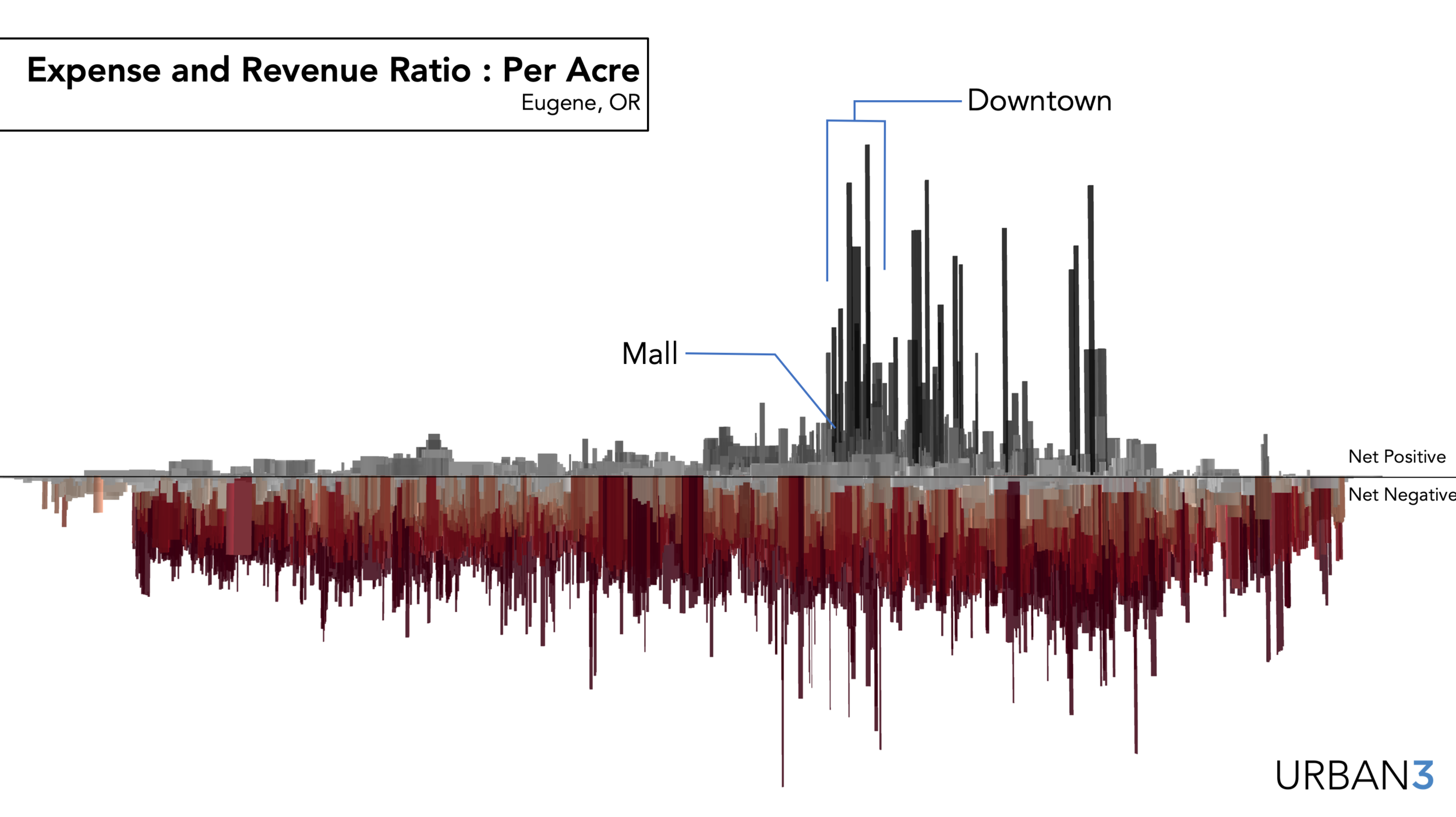
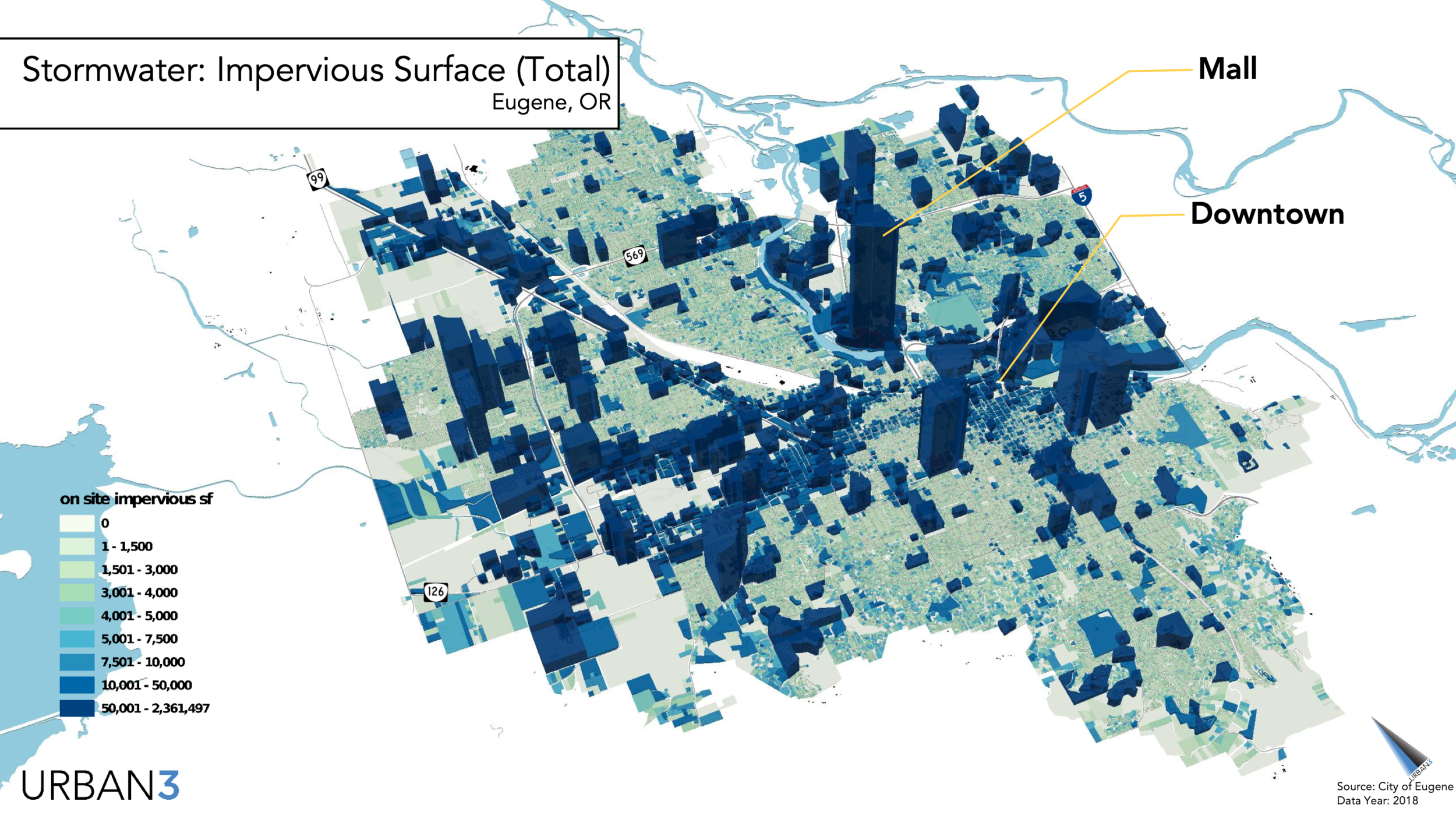
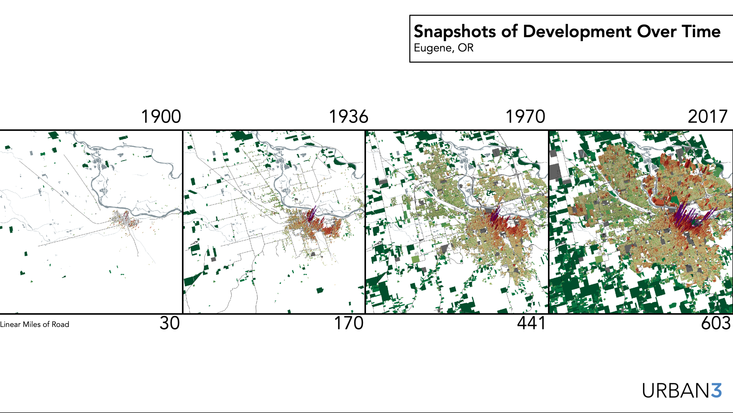
In the years following that fateful meeting in Madison, Urban3 has pushed to empower communities around the country with new insights into their own data. Inspired by Ian McHarg, we’ve elaborated from our first comparison of the two buildings in Asheville to map the concept of value per acre (VPA) across entire towns and regions. We view maps as geographic stories that make information real to people. We also look at the cost side of the ledger, and we look into the economic future with scenario planning tools. It’s not enough to know the revenues. As any Strong Towns advocate knows, our infrastructure costs are eating us alive. Our team of analysts work with complex information, but the resulting visualizations explain the issues in a clean and intuitive way. I’ve been met with a range of reactions, from inspired to skeptical to downright angry. Throughout the hundreds of talks I’ve given, here are a few things I’ve learned:
1. Keep it simple: Start small with a local example, and do the math on one of your own community’s buildings. For some inspiration, check out Daniel Herriges’ article featuring our work from last year: “Value per Acre Analysis: A How-To for Beginners”
2. Don’t just beat people over the head with statistics: tell them a story. Storytelling is as old as humanity, so leverage this to make your case for a stronger town.
3. Don’t tell people the issue, show it to them. The story of information should explain the issue.
4. Throw in a few jokes: it takes a great deal of humility to question ourselves, so keep things light.
5. Above all, be intellectually curious and honest. Ask questions about the systems and policies that shape our world, and interrogate why policies act the way they do, but keep your biases in check along the way.
We’ve found that whether it’s mapping road infrastructure, impervious surfaces, or value per acre, there is power in leveling the playing field. Information equity means allowing the whole community access to the same apples-to-apples data, and arming them with the ability to make smarter decisions for the long haul. In my work, it means ensuring that a sixth grader and a PhD in Economics should both be able to understand their community’s economic health. And in your daily life, whether you’re speaking at a city council meeting or introducing a friend to the Strong Towns movement, always remember — A picture is worth a thousand words.


About the Author

Joseph Minicozzi is the principal of Urban3 and an urban planner imagining new ways to think about and visualize land use, urban design and economics. Joe founded Urban3 to explain and visualize market dynamics created by tax and land use policies. His award-winning analytic tools have garnered national attention in Planetizen, The Wall Street Journal, Planning, New Urban News, Realtor, Atlantic Cities and the Center for Clean Air Policy's Growing Wealthier report. He holds a Bachelor of Architecture from the University of Miami and Master of Architecture and Urban Design from Harvard University. In 2017, Joe was recognized as one of the 100 Most Influential Urbanists of all time. He is a founding member of the Asheville Design Center, a nonprofit community design center dedicated to creating livable communities across Western North Carolina.
Conventional thought would tell us that the new commercial developments in a city should be the most productive compared to the older buildings downtown, but that’s not necessarily the case.