
Using Collision Mapping to Indicate Cycling Desire Lines
Darren Proulx works at Slow Streets, an organization that uses research to show why building human-centered (and not car-centered) places provides the best return on investment and leads to healthier, more productive cities. Today's essay is republished from the Slow Streets blog.
Next week is Bike Week at Strong Towns, so make sure to join us starting October 17 for a look at several bikeability issues that are impacting towns across the continent.
As cities across North America move towards implementing networks of protected cycling lanes, they are often hamstrung by limited budgets. For those cities trying to kick off the process, deciding where to install the first protected bike lanes can be like taking a shot in the dark. A good phrase that comes to mind is that it is difficult to judge the need for a bridge by the amount of people swimming across the river. In this sense, it is difficult to determine which bike lane locations will generate the highest usage when there are limited people cycling on the roads because of conditions that are not safe nor comfortable enough to invite people to cycle in the first place.

An example of a desire line. The city built the path way at hard right angles on the left. On the right is the dirt path showing how people actually want to move through the space. The shortest way! (Photo Credit: http://girodilento.com/category/advocacy-2/)
So how do you start deciding where to place bike lanes? The best strategy is to build bike lanes where people are already cycling. Usually there will be people cycling in your city along certain corridors regardless of the lackluster state of cycling infrastructure. This may include streets like 102 Avenue in Edmonton or 10th Avenue in Vancouver. These are often called desire lines, which represent a disconnect between how we design our cities and how people actually want to use them. The best way to understand a desire line is to go to your local park and look for the diagonal dirt lines cutting through a grassy area. People will always opt to take the shortest route regardless of how you want them to behave. Besides the small sampling of corridors that people may be using, how else can we find these desire lines?
Luckily insurance companies and police often keep detailed records of the vehicle collisions with people walking and cycling. Take, for example, the City of Edmonton’s 1,070 vehicle collisions (2009-2014) with people cycling that is now available thanks to the hard work of the Paths for People advocacy group (unfortunately the city uses an arcane in-house geocoding format for the collision locations and fortunately wewent through and manually entered each of the collisions into a map so that no one ever has to do this again. The geocoded data can be downloaded here).

Top: Each dot represents a vehicular collision with someone cycling. Bottom: This demonstrates how you begin to see some of the desire lines along corridors. (Source: City of Edmonton 2009-2014)
Typically collision data is used for safety improvement projects. However, mapping this data can serve as a proxy for cycling volumes to reveal patterns about where people are cycling. These patterns often materialize along corridors demonstrating latent demand for safe, convenient and comfortable protected cycling lanes. For example with Edmonton it is very clear that people want to be cycling on 76 Avenue, 82 Avenue, 100 Avenue, 103 Avenue, 104 Avenue, 107 Avenue, 109 Street and so on. Of course, you have to take the road dimensions into account when considering bike lanes on these streets, and the political willingness to tackle the public’s perceptions.

City of Vancouver Cycling Collisions Heat Map demonstrates people are still cycling on retail Streets like Denman St, Main St, Burrard St despite the lack of safe infrastructure. (http://vancouver.ca/files/cov/cycling-safety-study-final-report.pdf)
Often these desire lines form on the main streets that were the original street car corridors from long ago that still foster the exciting, fine-grain retail environment that people still love today. This can also be seen in a recent cycling safety report from the city of Vancouver. This makes sense, since people want to be where the action is. They want to see and be seen. These routes are usually also the most direct and offer the most convenience in terms of being able to see the businesses and stop spontaneously. The only caveat is to ensure that these collisions are not the result from trying to cross these corridors.

Cycling collisions analyzed by the time of the year can serve as a proxy for when people are cycling
Collision data can also give you an indication of when people are cycling the most. From the chart above it is clear that people start to pick up cycling again in March, until it peaks in July and declines through the winter months.
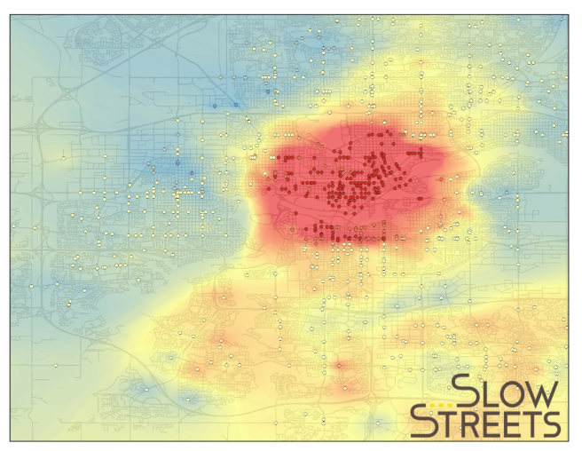
A heat map created using ArcGIS Hot Spot, which determines the areas that are statistically significant related to higher volumes of vehicle and cycling collisions. Based on this map the city would get the highest return on investment of the highest reduction in collisions per dollar spent in the Downtown and Old Strathcona areas.
Of course you can also do more a sophisticated analysis as shown in the example above using the ArcGIS Hot Spot tool. Based on this map, the city would get the highest return on investment with the highest reduction in collisions per dollar spent in the downtown and Old Strathcona areas. Incidentally this will also increase the rate of cycling and therefore improving cycling safety even further in a virtuous cycle.
For those cities and advocacy groups on a tight budget, collision data is a low hanging fruit that is often already being collected. Some data cleaning and geocoding may be necessary to transform into a usable format. Once ready it can be a inexpensive way to determine the desire lines for cycling.
Don't forget to join us for Bike Week, October 17-21, 2016.
Related stories

A mother tragically lost her life after being struck by a car—yet local media is fixated on the fact that she was riding an e-bike. What about the dangerous conditions of the street she was killed on?