Day 2, More on Charts
I’ve received some questions on the charts from today’s post and realized (again) that not everyone intuitively reads these things the way that I do. My apologies.
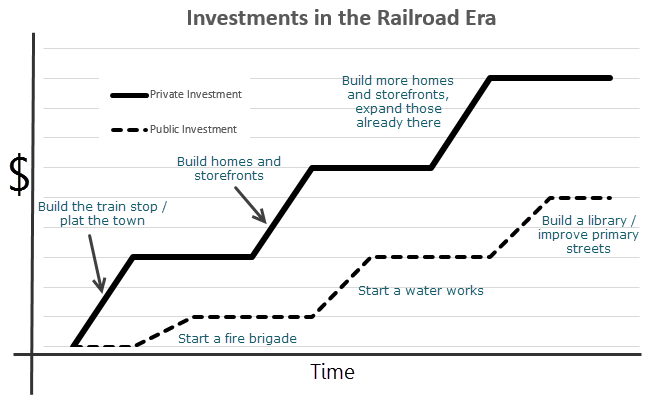
The first chart is meant to describe the relationship between private investment and public investment in the railroad era. I took out the axis labels in the original, but added the generic “$” and “time” to indicate that, what you are viewing is investment in dollars over time. I’ve also added some examples of the types of investments that would be common here. The takeaway is this: in the railroad era, private investment comes first and it is the success of that investment that ultimately prompts public investment. The public investment is a result of the private. This places the risk on the private sector and not on communal money.
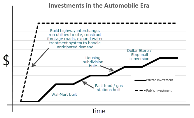
The second chart is meant to describe the relationship between private investment and public investment in the automobile era. Again, this is investment in dollars over time. The types of investments that are common here are different, as is the phasing. The takeaway is this: in the automobile era, public investment comes first in an effort to prompt private investment. The private investment is a result of the public. This means we – the general public – communally assume a large portion of the financial risk and the private sector, while not operating in a risk free environment, can limit their geographic risk ad focus on short term competitiveness.
This is essentially a way to graphically illustrate the Party Analogy.
Two different approaches. Two different relationships with risk.