Why Do Suburban Retrofit Projects So Often Get All the Details Wrong?
Gone are the days when a typical growing American suburb didn’t have a single building over two stories. While the classic images of suburbia remain the single-family home with a spacious lawn and the strip mall on a stroad, a slow but steady change has occurred over the past couple decades. We’ve witnessed the normalization of “suburban retrofit” projects: private developments that attempt to introduce a more urban form to the suburbs, with compact layouts, higher densities, taller buildings, more variety in land use (residential, retail, etc.) and more emphasis on walkability.
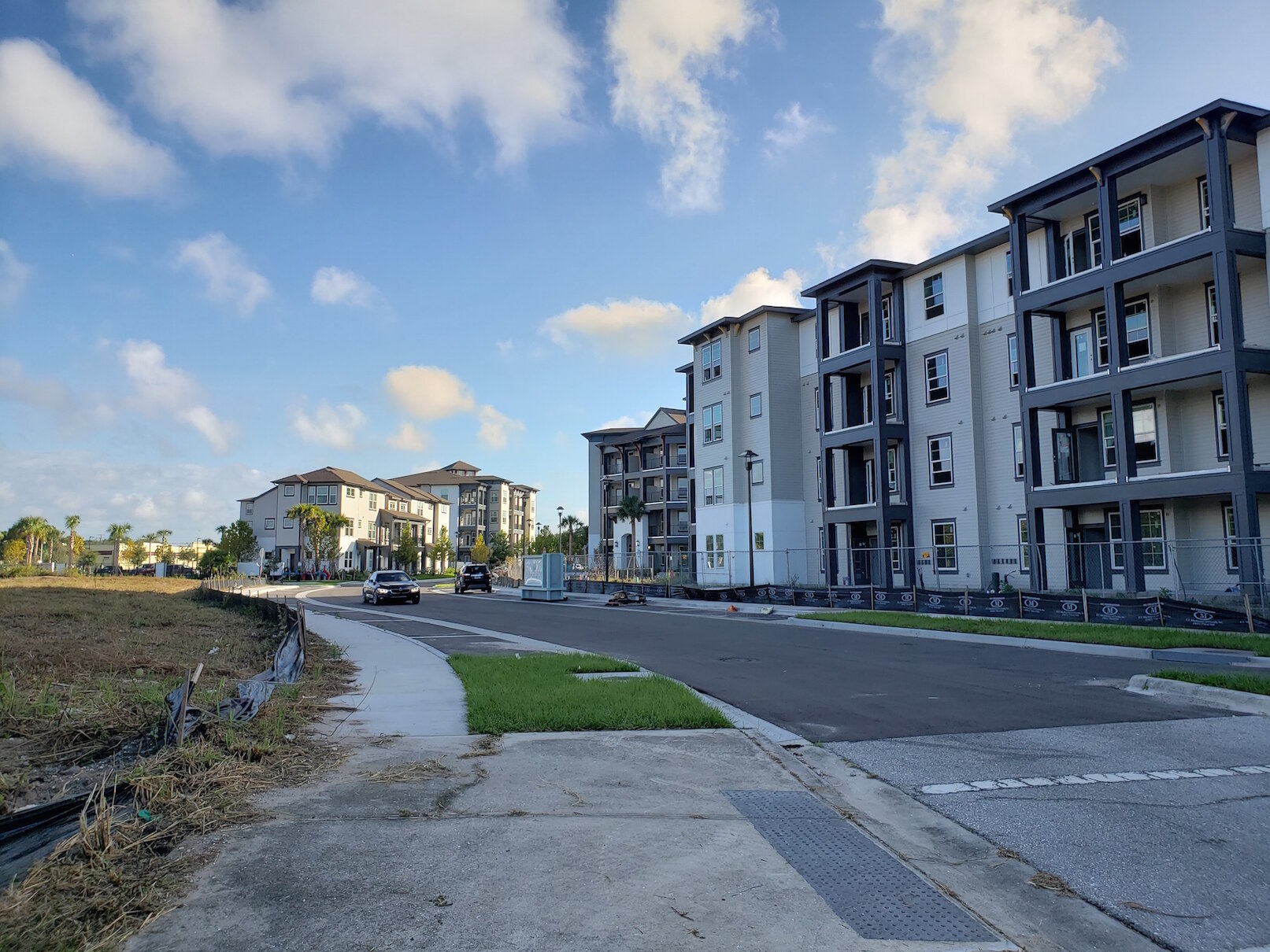
Mid-rise apartments tend to sprout up in little pockets of open land along major roads that were left undeveloped, like holes in Swiss cheese, as development filled in around them. In fast-growing places, the “Swiss cheese” effect is a common phenomenon, as landowners may sit on undeveloped land for a long time to speculate on its rising value, wait for the right market timing to develop it, or navigate a slow and complex approval process.
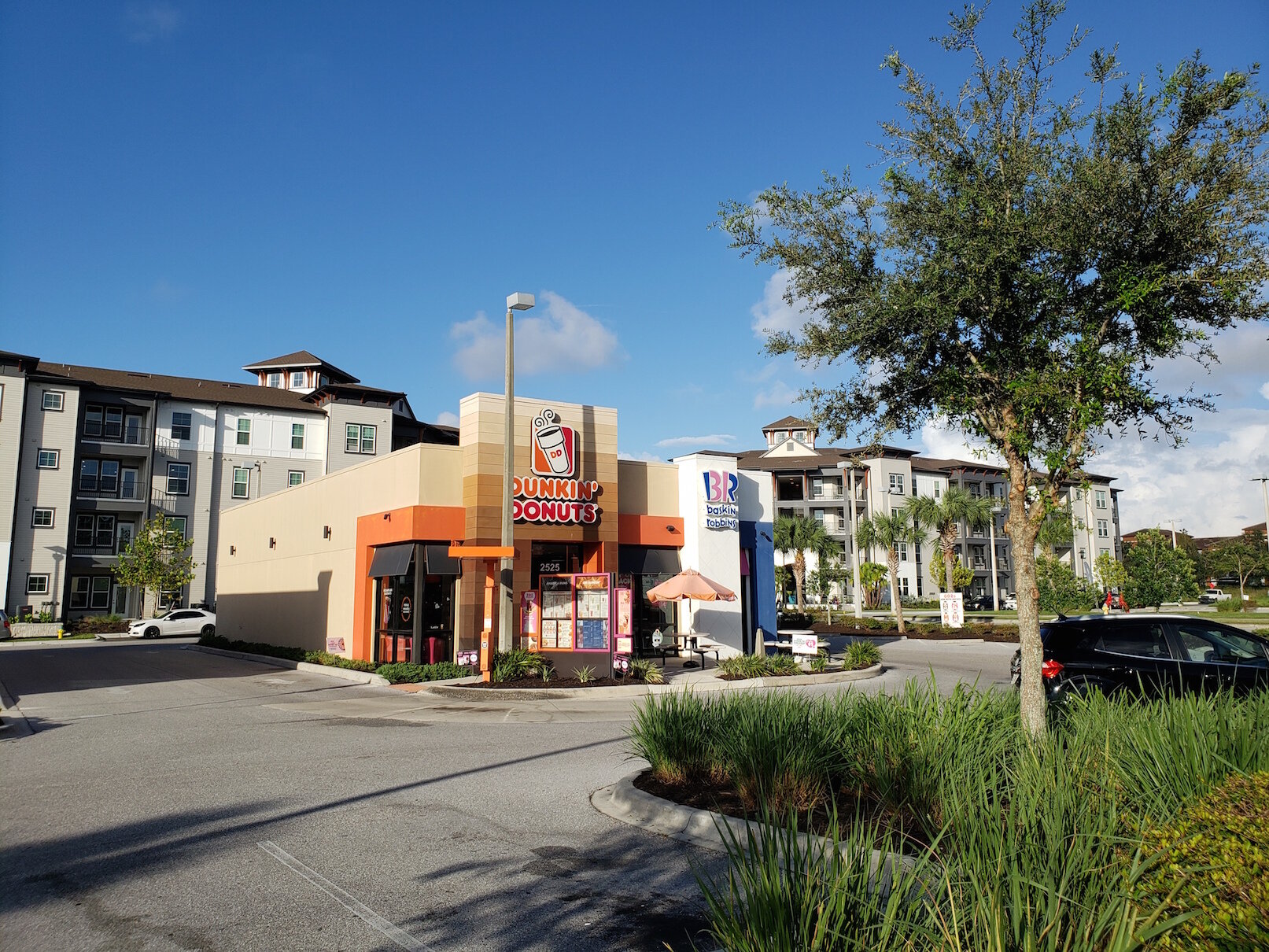
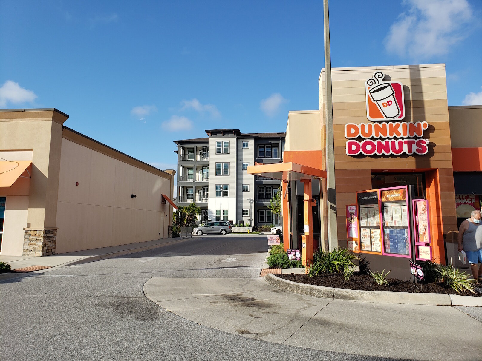
In the part of Florida where I live, the holes in the Swiss cheese are steadily filling in, and the large apartment complexes sprouting like sporadic mushrooms from a lawn after rain are quite a contrast to their low-rise surroundings. Most often, they are clusters of four- and five-story buildings with one to several hundred units in all. They’re pretty indistinguishable from new mid-rise construction near downtown, except that they are far more likely to be surrounded by outdoor parking lots, instead of being a Texas Donut or otherwise having an attached garage.
There are reasons to look favorably upon the idea of suburban retrofit. These buildings tend to produce dramatically more tax revenue per acre than their low-density surroundings (albeit less than the modest but extremely space-efficient buildings of a traditional downtown). This is why many local governments, watching their liabilities climb as their infrastructure ages, are increasingly zoning for this kind of development where they can—often against the strident objections of residents. They need the money.
The promise of suburban retrofit has never just been a fiscal one, either: it’s also been the notion that through this type of redevelopment, you can gradually convert places built around driving long distances into places with the ability to support things like mass transit and walkable 15-minute neighborhoods.
Unfortunately, these buildings are almost always fish out of water. When you get up close, you start to realize that what you’re looking at is an uncanny-valley facsimile of urban development, without any of the actual urbanity that makes people willing to trade elbow room for the advantages of living in the center of the action. Here, you just get the density and the height, without much action at all. Some of the form, none of the function.
Form Without Function
Here are the Harrison Apartments in Sarasota, Florida, a work in progress located firmly in strip-mall suburbia:
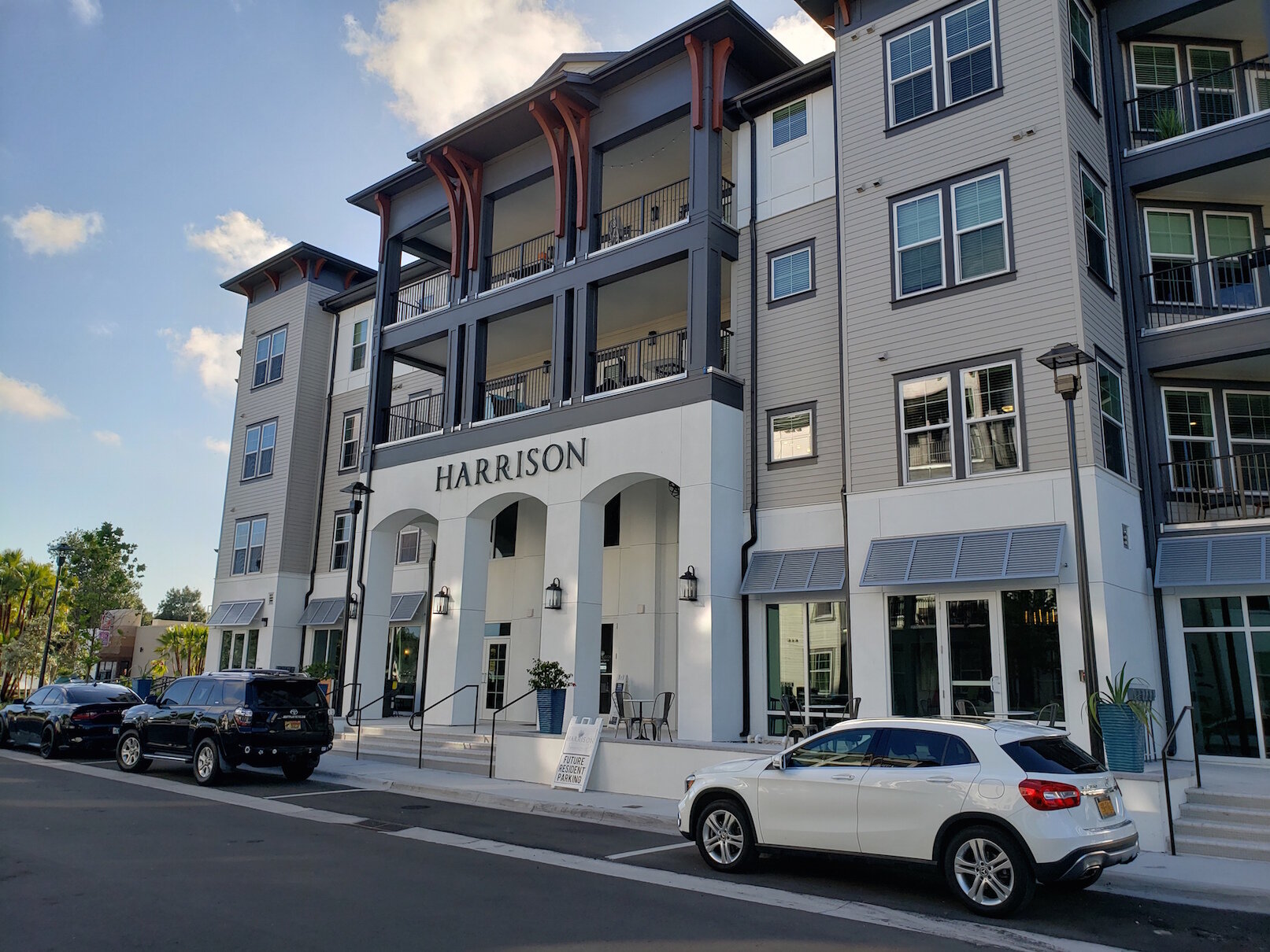
The form of this development checks some "urban" boxes, but only in a way that suggests lack of understanding of the point of any of them.
For example, consider the streetscape. A real urban street is a place for people to gather, not merely pass through in their vehicles. The reason an urban street should have welcoming facades, small or no setbacks, front porches and stoops, is that these things create an interface between the private realm of the home and the public realm of the street. They encourage neighbors to stop and chat with each other, kids to play out front instead of in back, and all-in-all transform the street into a true public realm and not just a utility.
Here we have the front doors and porches… sort of. But it’s clear from the landscaping that nobody is expected to use them as a primary entrance—you will park in the parking lot and enter from your car. Awkwardly placed utility boxes further undermine the notion that the street is in any real way the “front” of these buildings.


A similar project, Bella Grove, was completed nearby a couple years ago. It makes even less effort to maintain functional urbanity, even as it toys with the visual trappings of it. Here, the balconies, roof gables, and ground-floor patio entrances suggest we are meant to view this side of the building as the front. And yet the front facade of these apartments is behind a giant metal fence.
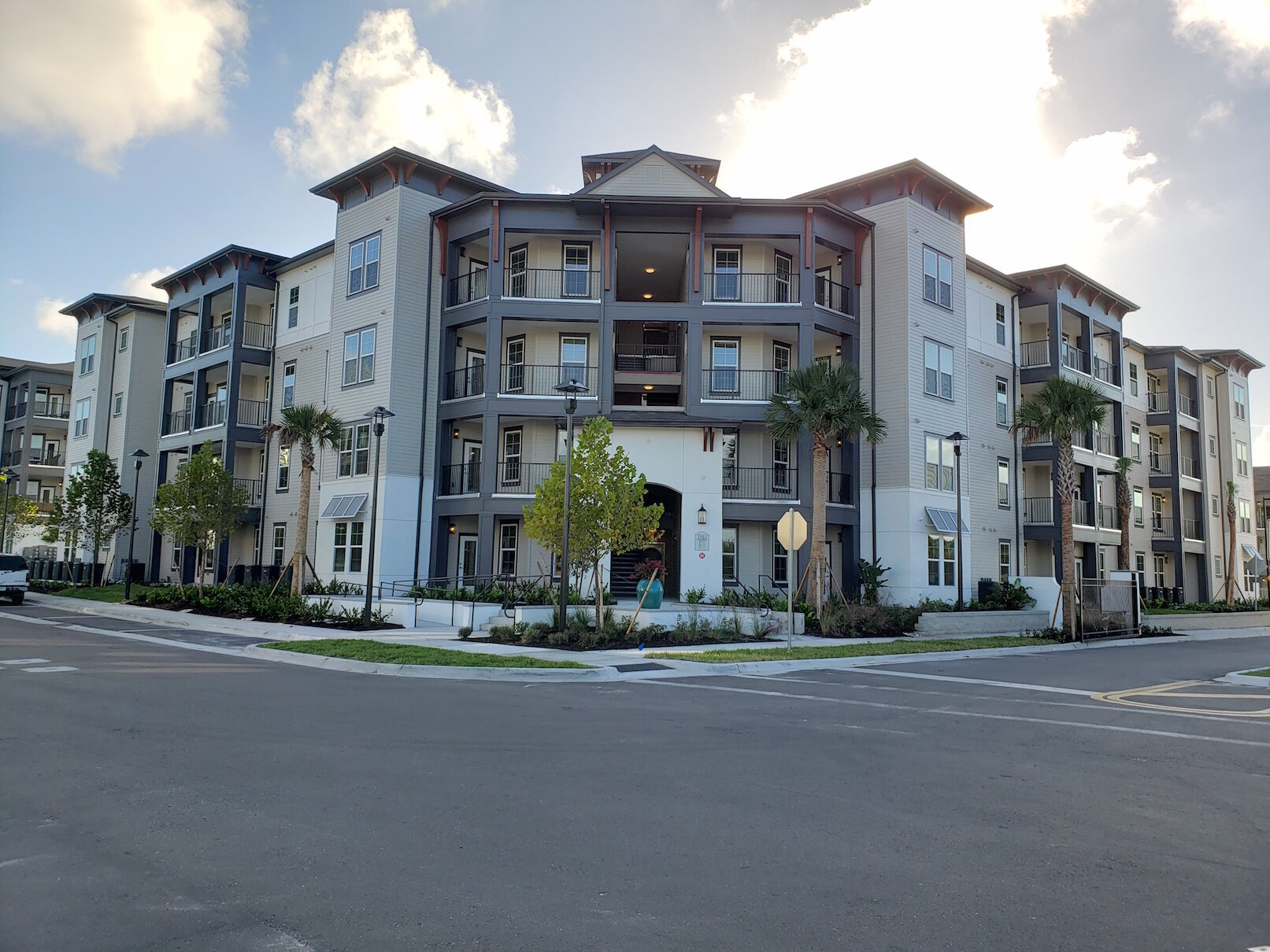
Here is the parking in back of the Harrison, with fenced-in dog run and scenic view of a Tire Kingdom store. This is the real entrance. The developer 100% understands that residents will treat it as the real entrance:
Contrast it to the street running through the center of the development. The actual street geometry is not terrible. Parallel parking serves to calm the speed of traffic. It could stand to be narrower and the sidewalks wider, but there are sidewalks on both sides and a mid-block crosswalk leads to a pedestrian path. That path, a walkway for residents between buildings, does little to draw the eye or be inviting, and it’s neither particularly central nor prominent. You can tell from the visible top of a pergola that the complex has shared recreational space, but it’s hidden from the street.


Still, ignore the odd details that suggest “This street isn’t for people outside of cars to actually use,” and you still at least get a bit of the movie-set illusion of an urban place. Until you look at what is immediately adjacent to this development. The juxtaposition is almost absurd.
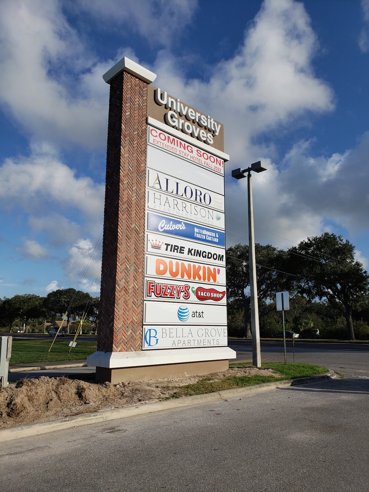
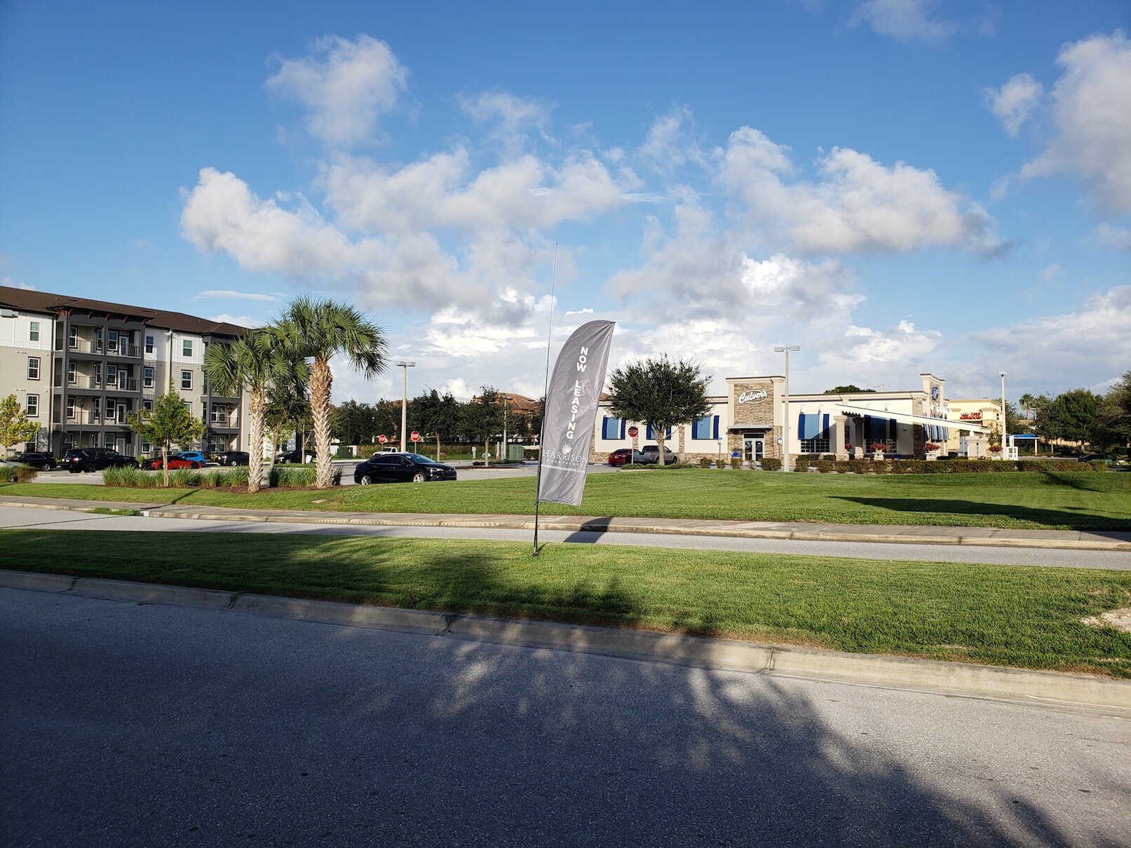
The selling point of real urbanity is concentrated life and activity. You sacrifice a bit of elbow room, peace and quiet in exchange for having stuff going on right near you: the world outside your front door. The Harrison Apartments can’t come close to delivering this. What would you even walk to? The adjoining businesses are all entirely auto-oriented, many with drive-thrus. In back (not pictured) is a gated residential area of single-family houses and townhouses. The main street onto which the Harrison empties is a six-lane divided stroad. Want to walk anywhere? You have to walk along this:
Even if you redeveloped more sites in a similar way, you wouldn’t be able to scale this up to anything resembling urbanism until you change the relationship with that road and others like it. It's only ever going to be an isolated pod, and it's only going to really make sense to leave that pod in a motor vehicle.
If this place is fundamentally built for cars and their drivers—and it is—then why bother with the streetscape, the front doors, the parallel parking (representing a tiny, inconsequential fraction of the number of stalls in the parking lot), all the things that distinguish this from a 1970's-style garden apartment complex?
I suspect it’s in part because New Urbanism, a movement now in its fourth decade, has won the planning and design culture war in one sense and only one sense: the aesthetics of urbanism are now in vogue. In some cases they’re built into zoning codes. The movement has done a remarkable job of mainstreaming some of its ideas about urban form, evoking the traditional American villages that are, genuinely, widely beloved. But those ideas have been adopted in a weird cargo-cult way by developers who don't actually understand or care about the purpose. The aesthetic says "vibrant" to them, and the marketing often uses garbage words like “vibrant,” “live-work-play,” “lifestyle.” Increasingly it even advertises “urban.” But the reality is mostly a new facade on the same old product.


Zoning codes across the country attempt to define what a "family" is, often in ways that are not only outdated but also legally tenuous at best. Instead of pretending we can enforce arbitrary definitions of family, let’s focus on what actually impacts people's lives.